Zimbra Sync and Share
Design for a web client to manage files using Zimbra's own cloud storage solution
Design for a web client to manage files using Zimbra's own cloud storage solution
In the summer of 2014, Zimbra acquired a small cloud storage startup called Mezeo Software. Mezeo had developed an impressive backend for the product that featured a powerful API, but the user interfaces had been created mostly as proofs of concept for customers to build their own. Zimbra wanted to use Mezeo as the basis of an end-to-end file sharing product, but that meant reworking or rebuilding the existing UIs. In the case of the web interface, we quickly determined that it would be better to build a new experience from scratch. We formed a “tiger team” to go from acquisition to product launch in 4 months.
Zimbra’s CTO Rob Howard was acting as the product manager for the project, so I worked with him to develop a loose set of requirements for the web UI. Once those were set, I was the only designer assigned to the product, where I was tasked with developing the information architecture, wireframes, hi-fi mockups, and a detailed design document. I also oversaw the design of a common file icon set and worked with two engineers (Ben Tiedt and Michael Monteleone) to realize the implementation.
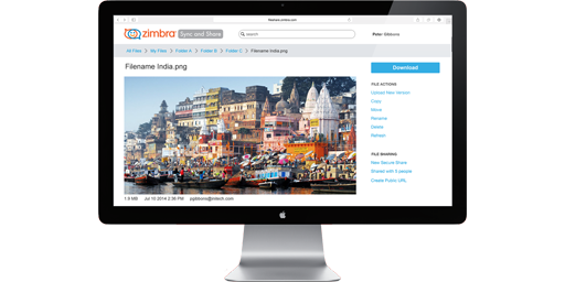
The first step of the design was to determine the overall navigational architecture of the web application. The structure had to mirror a standard file system with a root folder containing any number of branch level folders which in turn included files. But rather than opening files like you would from a desktop filesystem, we needed a file details view to display metadata about the file including version history, comments, sharing information and basic file information.
In addition to the standard file system mirroring there were also some other displays which were important. First there was a need to construct a Recycle Bin display, which was similar to a branch level folder display, but had specific functions and navigational constraints. There was also a need to display an Event Log, so users could track changes as they were registered by the system. This would include uploads, downloads, permission grants and the like. Lastly, we determined that it would be important for users to have a single place to go to manage all inbound and outbound file and folder sharing.

Once the navigation was determined, the other big question was to determine how actions would be presented. I divided the actions into two groups:
For selection-based actions, I wanted the actions to be closely tied to the selection mechanism, so I added a control for multi-item selection actions at the top of the list next to where it would show the number of selected items.


For navigation-based actions, I introduced a sidebar element which could house individual actions or groups of related actions. I also defined a primary action to be shown at the top of the sidebar, which was important for high-frequency and important actions.

I had used wireframes to determine the basics of the navigation and action architectures by defining what a branch level folder display would look like. Once the stakeholders and I were happy with that screen, I expanded the list of wireframes to include top level folder display and the file details display.
The top level folder display was just a derivative of the branch level folder display, but since there were no actions to put in the sidebar for the parent. We had determined that one of the primary usages for the web client was to bootstrap the usage of other clients, so I used the sidebar of the top level folder display to show direct download links for the desktop sync clients (Windows and Mac) as well as app store links for the Android and iOS clients.


The file details display was much more complicated. I wanted the mental model to be consistent, so I decided to treat the file as a shell that holds both the content and the meta-data. I worked with the CTO to determine the minimum data required for display and we came up with the following:
In addition to these common requirements, we also determined that there were some special classes of files that needed to be handled differently.
Given those requirements, I began by taking a two-prong approach, where I simultaneously developed wireframes for the generic file type as well as for the document file type. The assumption was that document display would be the most difficult and shouldn’t be left to be just built ‘on top’ of the generic display. Over the course of multiple iterations, I was able to settle on a single basic design which could be intelligently extended as needed for the various special file types.


One of the more difficult issues to resolve turned out to be the version history and comment history. I quickly determined that the two were very closely related, since the comments at any given point in time were a reflection of that file version. The problem is that there was pushback from engineering, because the API treated them as entirely separate entities. The engineers wanted some sort of toggle between either showing the comment list or the version list, rather than having to pull data from two sources and blend them in the browser. I was sure that the blended display of all items in a single timeline would be more intuitive for users, so I created a series of wireframes showing how the display would build over time from both sources. I then took those mocks to the UI engineers, but I also included the lead engineer for the backend API. After seeing the mocks, he was convinced enough to change the API, so the work for the UI engineers was minimal and didn’t adversely affect the schedule.
Following the completion of three main displays, I quickly filled in the ancillary displays as well as the modal dialogs, and loaded all the screens into InVision so I could start gathering a wider range of feedback.


An extremely useful feature of InVision is the ability to quickly link individual screens together to create a simple click through prototype. Using that feature, I was able to do some guerrilla usability testing on the design by picking people within our office that used other products like Dropbox, Google Drive, and iCloud.
Feedback showed that while the grid display of folder contents was visually compelling, the ability to see more of the filenames was incredibly important to some users. Based on this, I introduced a view toggle users could switch from the grid to a traditional list when desired.
The feedback also noted that requiring explicit selection or navigation to be presented with actions was sometimes cumbersome. To remedy this, I introduced a list of inline action links to the list display, where as space became limited the actions would overflow into a menu control. That same menu control could then be applied to the grid view.
As I was building out the prototype, the use of slightly ‘sketchy’ wireframes had never been an issue, but now that the design was being locked down, the UI engineers wanted to get a better sense of what the app would look like ‘exactly’. Thankfully, I was able to leverage another really useful aspect of InVision, which is the ability to automatically generate multiple screens from a single Adobe Photoshop file. Using the naming scheme already in place for my wireframes, I was able to generate a Photoshop file for each of the main screen displays, such that when I uploaded the PSD, InVision over-wrote my wireframes with the hi-fi mocks and all of the prototype linking remained intact.


Zimbra had traditionally rejected the impulse to create highly detailed documentation, but instead preferred to concentrate on maintaining development velocity with constant iteration. This had worked great for engineering, but had become something of nightmare for the quality assurance, technical publications, and customer support teams. Design docs weren’t a remedy for the situation, but they were a step in the right direction, so I instituted a requirement for my team to create and maintain design docs in the company’s internal wiki.
At the same time that I was generating high fidelity Photoshop mocks for the prototype, I wanted to set the example for my design team by adding detailed design documentation in the internal wiki. I broke the document into individual pages for each screen, each dialog, and most importantly for each component. I defined a component as any silo’d piece of functionality that would be reused across multiple screens and/or dialogs. The usefulness was two-fold, because it prevented me from having to describe the same thing in multiple places, and it forced me to work out any inconsistencies across the screens.
The use of a wiki for the documentation wasn’t accidental, as I knew that a web-based mechanism would be the most usable choice for my team. Specifically, I was able to embed remote images into the document which were sourced from InVision. This meant that when I made a change to the Photoshop file for a screen, the generated screen images would be updated automatically in the documentation display. (You’ll note that I’m really big on the idea of single source of ‘truth’ when designing software.)
As I was finishing up the design docs for the project, my role switched over to more of an advisory function. If there were any outstanding questions from engineering, I would answer them and make sure the answer was recorded in the documentation.
Over the course of about 6 weeks, the application went from proof-of-concept to reasonably complete with regard to functionality. In a desire to get better feedback before the official launch, we decided to roll out the service internally and collect feedback. Feedback was separated into bugs where implementation didn't match spec and usability improvement requests. I used those requests to improve the design based on the feedback and scheduled those changes back into the engineering roadmap.
In the summer of 2015, Zimbra the product was reasonably stable and ready for wider release. At the same time, the business drivers decided to back away from the file sharing market, as they believed they couldn't compete with the entrenched players in that space. So although the product was improving steadily and nearly ready for release, the plug was pulled.