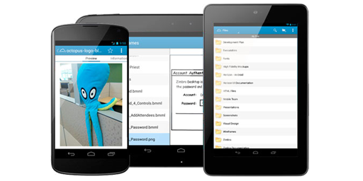
VMware Horizon for Android
Design for an Android mobile client for VMware's Horizon enterprise file and application tool

Design for an Android mobile client for VMware's Horizon enterprise file and application tool
Following VMware's acquisition of Zimbra in 2010, the end user computing management team wanted to utilize the Zimbra's core server technology to create another product offering. Product management determined that an enterprise cloud file sharing product would fill a gap in the market. Since Zimbra already offered a limited Briefcase feature, it seemed like an easy extension, so "Project Octopus" was initiated. To present a complete offering, it was determined that the product should ship with a web client, a Windows sync client, a Mac sync client, an iOS mobile client, and an Android mobile client.
Since I was already working full-time on Zimbra Collaboration, we hired another designer for Project Octopus, but it quickly became clear that five new clients would be too much for any one designer. Because I had more extensive experience with the Android platform, I volunteered to lead the design for the Android moblie client as well as to consult on the web client.
In 2011, iOS was clearly the dominant mobile platform and the Android platform was generally considered to be inferior with regard to usability, but about that time Google released Android 4.0 (Ice Cream Sandwich) and more importantly they had published a set of design guidelines for Android development. Much like the Mac and iOS guidelines from Apple, these were meant as a reference for developers with the desired outcome being that applications which followed the guidelines would be more consistent and more usable.
Some of the project stakeholders were lobbying to create a single iOS user experience and just use that for Android as well with the assumption that it would be easier to build and would be more usable. I had started using Android's earlier Eclair release and had seen the improvements being made in OS. Together with one of the project managers and a lead developer, we championed the idea of creating a 'pure' Android experience where only the underlying data structure would be shared with the other clients, and the UI would follow the ICS guidelines.
With regard to functional requirements, those were provided by product management for both the iOS and Android clients, so they were required to do the same things, though not necessarily in the same way. Architecturally, we concluded that we'd have to represent the synchronized file system as a hiearchy. That part was simple, but we also had to show how to represent shared files and folders. Because we didn't want the user that doesn't share files to have to navigate 2 levels down to their files, we decided to mount shared files and folders as though they were placed in the user's root folder alongside their personal files. That also meant that we had only two main object views to develop: folders and files.
In addition to the simple folder and file structure, there were four other necessary displays that would be secondary:
With an architecture in place, I began by wireframing some possible layouts for the application. Displaying a list view for the folder seemed relatively simple. I also introduced a contextual selection mode, so users could select multiple items and perform actions. The combination of the blended local and shared objects, the combination of folders and files in a single list, and the varying permissions on shared files made the list of contextual actions rather complicated. To sort this out I created a matrix of all the contextual actions and all the various selected objects to show what actions were available when.
The file display was a little more complicated than the folder list view. The file display needed to present the following information:
Based on that list of requirements, I quickly concluded that:
Since I didn't want to present users with a mostly empty UI, I decided to utilize Android's scrollable tabs, where the tabs would be:
With both folders and files accounted for, I needed a method for switching to the secondary views. I had considered introducing a drawer, but it would've been a heavy component to introduce just for 3 additional items. Another alternative I considered was to add the list of views to the action menu, but that would've been a little more difficult to find and would overcrowd an already full list of actions. I decided the best way to proceed would be to introduce a spinner component to the action bar. The advantage of the spinner was that it was a visually persistent control which could be accessed from anywhere in the file hierarchy.
Because I had built all the wireframes in Balsamiq, I was able to not only link the screens together to create a simple click through prototype, but I was able to publish all the wireframes in a single PDF file. This was useful, because we were 'dogfooding' our own product at the time, so I was able to share that one document with all the stakeholders. That way we all knew exactly what the latest version of the design looked like, and everytime a new version was published, everyone was notified. Not once during the project did I have someone come back to me with questions while referencing an out-of-date version of the document!
For the visual design of the application, I was torn between two competing priorities. On one hand, we had decided that we were building a 'pure' Android app, which meant that we should use either the Holo Light or Holo Dark theme as specified by Google. On the other hand, we were also building a VMware app that needed to reflect the VMware brand. Since VMware didn't have mobile design guidelines at that point, I negotiated with the visual design team to use Project Octopus as the "guinea pig" for what would become the standards for mobile. For Android, that meant that we started with the Holo Light theme, as it was better suited for reading text. Then we chose a few key places throughout to be branded for VMware. The places we recommended were the Sign In sequence as well as the background color for the Action Bar that persists at the top.
As development progressed, we knew that we'd need final graphics for all of the button icons, so we contracted with the VMware visual design team to provide assets. What we hadn't necessarily planned on was the fact that icons had to vary both by resolution (mdpi, hdpi, xhdpi and xxhdpi) as well as by OS version (Froyo, Gingerbread, and Ice Cream Sandwich). What that meant was that for every icon we needed, we had to manage 12 slightly different files and they all had the same name!
Rather than trying to explain the subtle differences to our visual designer, I instead worked with him to provide a single high-resolution (xxhdpi) icon in solid black. I then created a Photoshop macro that would start with the base icon and automatically generate all 12 output icons to the proper directory structure and apply the correct opacity changes, gradient overlays, etc. for each. There was definitely some trial and error involved, but in the end the ability to regenerate the entire icon set in a few clicks likely saved many hours of painful drudgery and let our visual designer concentrate on the form of the icons.
At what could be characterized as an early-beta stage, we began showing the product to potential customers and even showed it off at VMworld. The reception was tremendous, and the biggest complaint we heard was that it wasn't shipping yet. At the same time, VMware had also been pushing a new single identity solution for businesses as well as a solution for managing application access. Both of these solutions were being developed under the umbrella title of "Horizon", but because they required significant and deep integration commitments from the customers, the reception for them had been luke-warm at best. So in a "completely unexpected move", VMware management decided to join the feature which all the customers wanted with the features that VMware wanted all the customers to adopt. The VMware Horizon Suite was born.
What this meant for the Android application was that it would need to expand to not only include file management features, but it would also include a launch portal for the authorized applications and a method for side-loading Android applications to your device. It was also decided that the tablet versions of the application would be able to connect with VMware View, so users could could remotely connect to their Windows desktops. Those features on their own didn't seem especially problematic, but adding them to our already-built application required introducing a new top-level of navigation. The natural location for a top-level switcher was the spinner control which I had used for the secondary views, but that meant that I'd have to move those to another location. A drawer had been my secondary choice, but it was deemed too late in the engineering cycle for a structural change like that. Instead, we went with my third choice, which was to insert the secondary views into the action bar menu. To mitigate the issue of too many actions in the menu, we limited the secondary view display to the root file level only. It wasn't my favorite solution, but it was the best choice given the constraints at that time.
Once I had determined how users would access the application management portion of the app, I had to build out the design for the how users would select and activate the applications they had been given permission to use. Given that the Horizon "apps" project had been developed concurrently with Project Octopus, they had already defined what they considered to be a complete API. The only problem is that they hadn't applied that API to an actual user-facing interface and likewise hadn't thought through what the user's perception of an application's lifecycle would look like. While coordinating with the other designer on the project, it turned out that the Android app was the first to deal with the issue. Using realistic user scenarios, I was able to create a state diagram for how user's would perceive their available applications.
Then using that diagram I created as well as some wireframe mocks, I met with backend API engineers to get the changes applied. The problem was that the backend engineers were convinced that what they already had was sufficient. With more time, I might have been able to convince them that the changes would improve the user experience, but, thankfully, the three Android engineers I was working with (Jeff Blattman, Boris Burtin, and Dave Comfort) were exceptional and found ways to work around the API to achieve what we wanted.
VMware Horizon for Android was first released to the Google Play store in October 2012 for beta, and the first RTM version of VMware Horizon was released the following Spring. While the overall product didn't get the rave reviews we had hoped for, the Android client generally stood out as the most complete and well engineered of the clients. I even ended up giving a presentation on the design and development methods we'd used in the project for VMware's User Experience conference. (VUE 2013)
At the time of this case study, the application is still available as VMware Horizon Files on the Google Play Store.