Zimbra Consumer UI
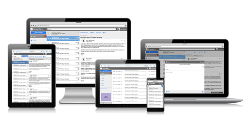
Design for a consumer-focused responsive HTML5 web client for Zimbra Collaboration
Design for a consumer-focused responsive HTML5 web client for Zimbra Collaboration
In early 2015, one of Zimbra's largest US consumer service providers came with some requests.
Moreover, this customer had forked the Zimbra UI code many years back, so they hadn't reaped the benefit of any of the usability improvements the engineering team to implemented since I joined the team.
Zimbra was very resource constrained at the time and only had two product managers for the entire company. Worse yet, they were both overloaded with other work and had no availability for a project this big. Therefore, I took on the roles of both product manager and product designer for this project.
My first job was to put on my product manager hat and find out whether or not these were isolated problems for this customer. Even though this was a very large customer, Zimbra was small enough that it couldn't dedicate resources to something that only benefited a single customer.
To determine how pervasive the issues were, I compiled a list of our other consumer service provider customers. I then coordinated with our sales reps for those customers and setup individual interview meetings with the general theme of "What could we do to help them improve their business?" During the course of the interviews, I would guide the conversation as needed to touch on the original issues as well as gathering any new issues.
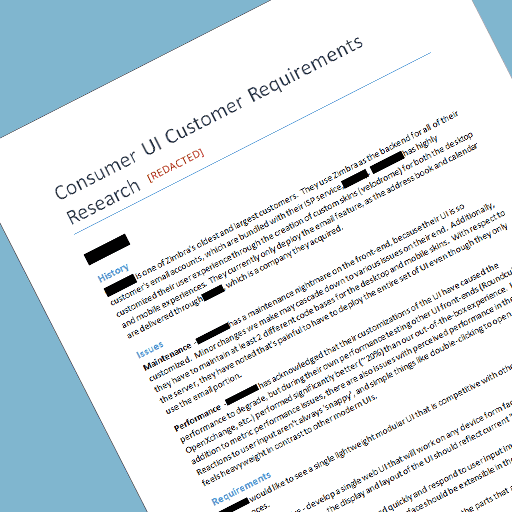
I correlated the results of the interviews into a single high-level requirements theme document, where the primary themes were:
With this list in hand, I went back to each of the customers to verify that I had understood their needs and translated them correctly into the list. Responses were all positive, and the customers were excited about the attention we were giving to their needs and direction in which we were going.
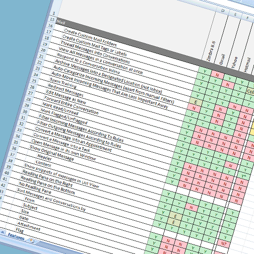
Once I had confirmed the overall themes of the project with the customers, my next step was to dive a little deeper. The biggest unknown from the themes was "Simple". Rather than just chopping functionality randomly, I wanted to be sure our product would be at least close to other clients in that same space. I created a feature spreadsheet of what our existing UI permitted. I then created a list of competitive products in that space and systematically tested to see if each product supported each feature. Once completed, a feature list for our new consumer UI was relatively easy to generate.
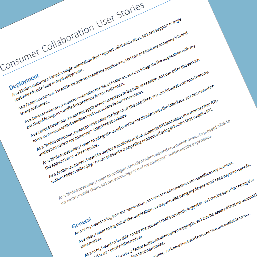
The problem at that point was that an Excel spreadsheet wasn't a viable tracking tool for implementing features, as it didn't convey any sort of reasoning or usage for the feature. My next step was to put my product designer hat back on and generate a set of user stories, which took the standard format of "As a {User}, I want to {Action}, so I can {Reason}". These covered the list of requirements for a minimum viable product, the list of desired future enhancements, and something novel: a list of features that were explicitly being omitted. That last part may have been the most important, as anyone knows that adding features is easy, but it's much more difficult to take them away. I wanted to be sure we only added features we explicitly desired rather than throwing in anything we could include.
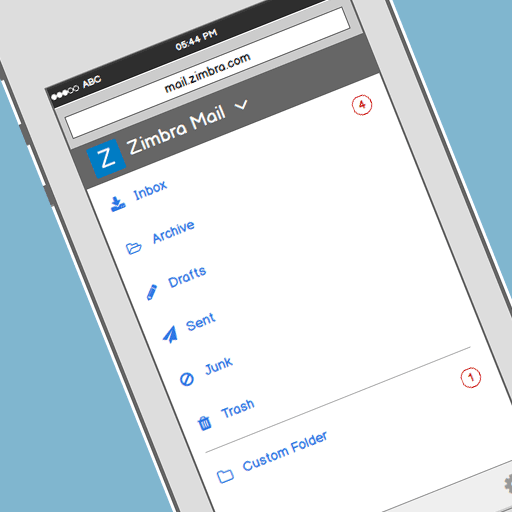
Once I had a set of features and a clear list of user stories, I began creating wireframes for the new product using Balsamiq. Using a "Mobile First" methodology, I started with the phone form-factor, as it is easier to grow a design into a larger screen, rather than trying to trim one to a smaller screen. One of the first questions to answer was, "What should the navigational system look like?" Unlike a native mobile app, this web app would have to include all the features as a single branded app, rather than individually distinct feature-specific apps. (ex. Mail, Contacts, Calendar, etc.) This app also had to be customizable so that features could be added or removed. Based on those choices, having a dedicated full-screen picker display made the most sense.

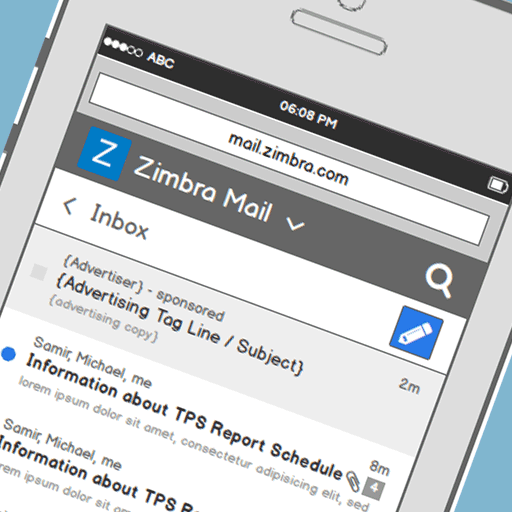
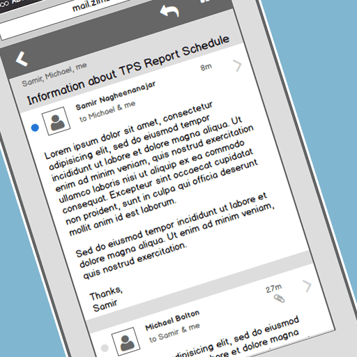
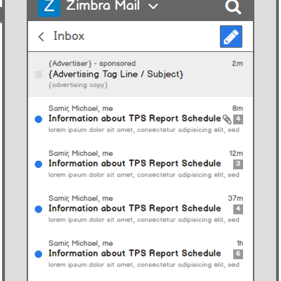
I then started with the default mail list display for the Inbox, which I determined needed the following controls:
Given that screen space was limited, I elected to group some of the items together. The top of the screen would have a dedicated action bar that would house a branded icon for the customer and a branded name for the mail app. Together they would act as a single button to initiate the feature list picker screen. Because search isn't limited to the scope of the currently selected mail folder, I also placed the Search button in this bar to better reflect its more global nature. Since this action bar included the branded elements, I also determined that the background color of this element should be customizable by the user to reinforce branding. Text color and the search icon color would reverse polarity based on the customer's chosen brand color.
Below the global action bar, I created a secondary action bar that would house the label for the current folder, which could be extended with an icon to act as a button for changing the current folder. I also elected to place the New Message button in this action bar, not because it was local to the folder, but because it was important that it be easy to find. Color is a relatively easy method for drawing attention to a control, but I had already elected to give control of the background color of the global action bar to the customer, so that wasn't a viable choice. I briefly considered using a floating action button as would be found in Google's Material Design, but I didn't want the app to be too closely associated with another company's distinct UI elements.
With the global and local action bars in place, the remainder of the space allocated for displaying the list of conversations/messages.
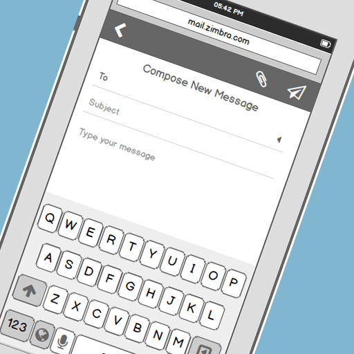
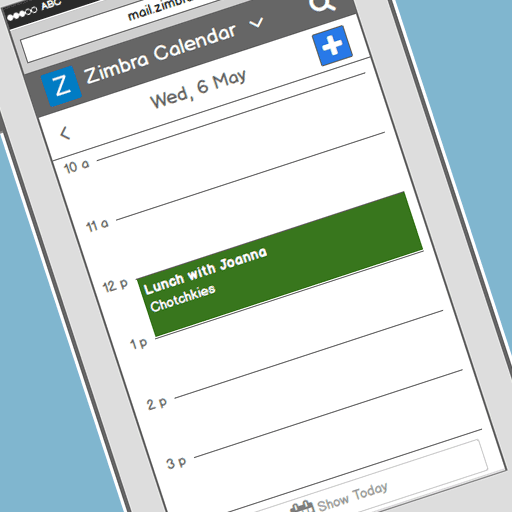
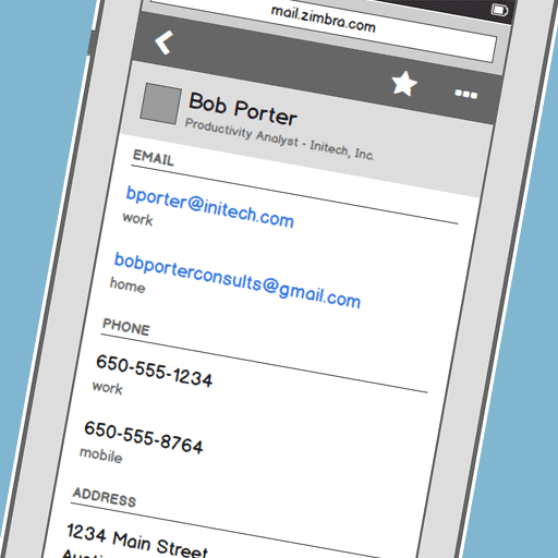
A similar process then continued for each subsequent screen in the Mail application, and then later expanded to include the Contacts and Calendar features as well. I elected to leave Tasks, Files and Chat out of the list of wireframes, as their usage by our consumer service provider customers was significantly lower.
While designing an entirely new responsive interface presented many challenges, one particular challenge stood out to me, because it fixed an issue I had run into previously and I was pleased with the result.
Background: While developing the Zimbra Touch Client a couple years before, an issue had arisen regarding spam. Specifically, it was noted that the only way to mark an item as spam was to open it. Security-conscious users didn't find that to be an acceptable answer, both because they didn't want to open the message and there might be many messages to mark. We put it on the backlog of things to fix, where it sat in the low-priority queue. For the consumer UI project, I wanted to make sure we didn't have the same problem, so I brought it to the front of the queue.
Requirement: The application must support a method for marking one or many messages as spam, without requiring the user to open messages.
Research: I immediately looked to see how other apps handled the situation. The answer was that most every phone app used one of three strategies.
Thought Process: I knew immediately that the space requirements of a persistent mechanism wouldn't work, and I'd have to use some sort of multi-select mode. But rather than including a button onscreen for something that is a secondary workflow at best, I wanted to find something a little more elegant. That meant that I needed another method for invoking the multi-select mode. I considered some of the standard actions, like long-pressing to select the first item, but I thought that could be improved.
I tried to consider what the screen would look like on larger devices, and I settled on the idea that there would be a checkbox to the left of each list item. Taking that back to the phone screen size, I imagined that the checkboxes were still there, but were being cropped by the screen. That lead to my conclusion that the checkboxes should be revealed by a swipe gesture to the right as though the off-screen checkboxes were being slid into view.
Since I was already determined to use left-swipe actions for triage type actions, like archive and delete, right-swipe seemed like a natural fit. The one weird problem was that left-swipes would be per item, while right-swipes would alter the entire list. To account for that I had the idea that after the short swipe to reveal the checkboxes, the swipe action could continue on an individual item. Then once a threshold was passed, the item would be in a 'selected' state. That resulted in a single swipe action being used to both reveal the multi-select mechanism as well as selecting the first item.
Solution: I spent a little time in Photoshop mocking up the action and adding florishes, such as the bounce when the selected item was released. This solution still has an issue regarding discoverability, but that could easily be addressed with the addition of some tour tips for new users. More importantly, it improves on the use of screen space for both the selection mechanism and a method for invoking a selection mode. And it does it by maintaining a logical layout model and using natural gestures for the reveal.

During the wireframing phase, I had been exporting the individual wireframe screens from Balsamiq as PNG image files. I then copied those files into my InVision sync folder which automatically uploaded the files to my InVision project site. This was exceptionally useful because I could share the individual screens with others to get feedback and suggestions. What became even more useful, was the ability to wire the screens together into a clickable prototype.
During the prototype phase, I was able to sit down with a half-dozen or so test subjects and walk them through the app to see what worked and what didn't. A good example of the feedback that came from this was the evolution of the button to change the currently selected feature. Initially the button included just a square icon and the name of the feature, so some users didn't immediately recognize it as a functional control. I had a hunch that it might be an issue, but I wanted to err on the side of simplicity to begin with, but a change was clearly necessary. By simply adding a dropdown arrow to the end of the text, all the subsequent test subjects immediately recognized it as the control for changing the feature selection.
The other feedback I got from the testing was that the experience was somewhat flat and choppy. I had assumed that the implementation would use animated transitions to make the experience more fluid, but I hadn't considered including them in the wireframe prototype. I thought it would be too difficult and time consuming to justify the work. Thankfully, at about the same time I had read a blog post from InVision explaining how to use Keynote to create animated GIFs for transitions. Rather than using Keynote, I instead elected to use Photoshop which allowed me to place linked screens from my original wireframes. Thereafter, when I updated my wireframe screens, I could easily run a macro to update all the linked screens and re-export the animated GIFs. Obviously I didn't do this for every transition, but by introducing it in a handful of key areas the feedback on the quality and fluidity went up drastically. This also turned out to be a key factor in the upcoming customer feedback step.

The entire point of creating a prototype was to gather feedback on the direction without having to invest engineering time. The most important feedback is from the customers that would actually be using the product. While it had taken a long time for the sales reps to coordinate the initial interviews at the beginning of the project, it seemed that it had become even more difficult to get time with the customer stakeholders at this point. Rather than just wait it out, I decided to use a different tactic. I knew that the first 15 minutes of any meeting we had would consist of me doing a sort of show-and-tell with the prototype followed by a question and answer session. To eliminate that step of the meeting and to build excitement from the customer, I instead used Quicktime to record a movie of me stepping through the entire prototype. With some voiceovers added in iMovie, I was able to export a 10 minute movie which could be sent to our customers to re-initiate the conversation and continue the feedback process.
I'd love to finish this case study with how the prototype was converted into a real application with amazing results for the customers, but the reality (like most things) is more complicated. At the stage where the movie was completed, we had just started getting meetings setup with the customers, but something big changed. Zimbra announced internally that due to financial issues, they were restructuring. The restructured business would focus on the expanding Business Cloud Service Provider customers, and that our Consumer Service Provider customers would be moved into a sustaining mode where we wouldn't be developing new initiatives for them. That marked the definitive end of this project.