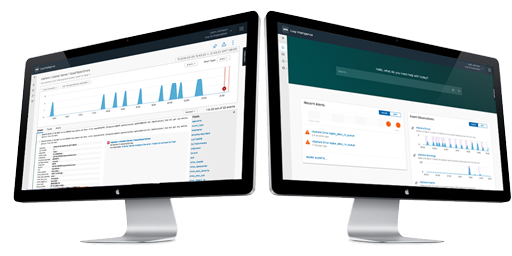
VMware Log Insight Cloud
Designing VMware's First Cloud-Native Log Analytics Service
Designing VMware's First Cloud-Native Log Analytics Service
In October of 2016, VMware gathered a group of product, design and engineering leaders in Seattle to lay the groundwork for a major shift. To date, all operations software was traditional on-premise installed and managed software. The group was there to discuss the transition to a software-as-a-services (SaaS) platform for future software. It was concluded that the first solution would be a log analytics platform, and the project was called “Black Pearl”. This was in reference to the mythical speed of the ship in Pirates of the Caribbean, because the schedule for the product was unprecedented in that business unit. The goal was to be in Beta in 9 months and to privately announce that fact at VMworld 2017.


At VMware, I was the UX design lead for all operations management software within the Cloud Management business unit. That encompassed overseeing and directing design decisions for a number of products and services. As this new project was ramping up, those other products required all the existing UX resources, so I took on all design responsibilities for the Log Insight Cloud product, including research, UX architecture, interaction, and visual design.
Through conversations with potential customers and domain experts, two target personas emerged from the collected data.

The first persona which I called Anthony, is an infrastructure administrator that has deep but siloed knowledge about the log data generated by the infrastructure. Anthony generally knows what he's looking for and uses a log analytics tool to help him find it. This is the persona most often targeted by products in this space.

The second persona to emerge was called Anita. She too is a virtual infrastructure administrator, but her knowledge is more broad but typically more shallow. She does most troubleshooting in higher level metric monitoring tools and sees log analytics tools as a last resort. Anita would be the more difficult persona to please, but could also be a strong market differentiator.
Like most traditional enterprise companies, VMware has typically followed a very “waterfall” development model, where the entire scope of the release is defined early in the process. The team quickly agreed that that model wouldn't work for SaaS software. Instead, we adopted an agile/scrum model, which also led us to to prioritize the most critical features for a first release. Some were driven by customer needs, while others came from business needs and included things like:
Based on the high-level features we defined for the MVP, I then went about defining a set of narratives. The rest of the team found these to be somewhat novel, and to many it wasn’t clear what the value would be, but I had seen first-hand on my previous project how important they were to building alignment to purpose and not losing track of the ‘big picture’.
Five narrative scenarios were eventually defined, which we felt were representative of how the product needed to function before going to Beta. The scenarios included:
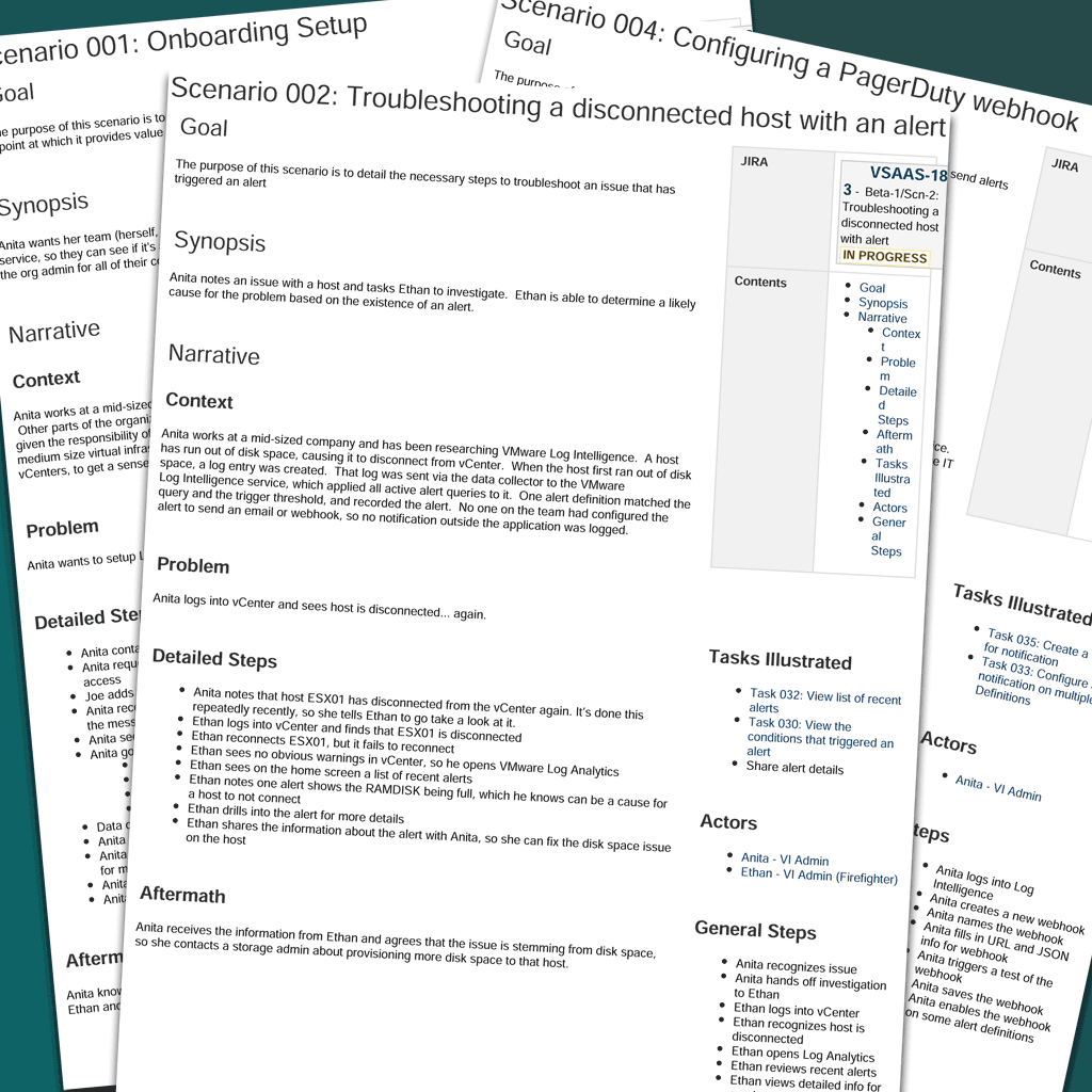
The narrative scenarios were relatively simple in structure. Each scenario had a:
As the scenario was broken down into its logical parts, a series of individual task flows emerged and were documented. These task flows consisted of constrained bits of functionality that didn’t meet the user’s goal, but assisted along the way. These included things like signing into the application or saving a query.
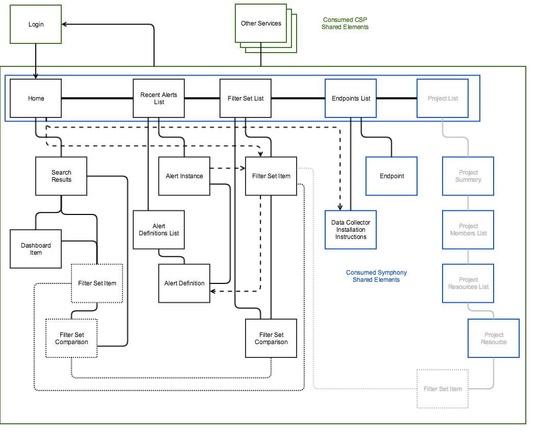
As the tasks were being defined, I also began laying out the overall locomotional model for the application, including the navigational structure and common patterns about how various object types would be manifested. This turned out to be the first big design constraint for the application, as the requirement to tie into the broader service architecture came with constraints to the interface, which included a single common header which could not be altered and a requirement to handle navigation in a docked left navigation panel.
At the same time the task flows were being developed, I began wireframing the corresponding screens in Balsamiq. I repurposed a system I’d developed when I was at Zimbra, where I exported screens from Balsamiq into PNG files, which I then imported into Sketch as individual artboards. The Sketch file was synced to InVision, where the artboards were turned back into screens. By doing this, I could rapidly change the Balsamiq project and with a few clicks have those changes reflected in the InVision prototype. (note: this was before InVision broke their sync tool, which I still don’t forgive them for.)
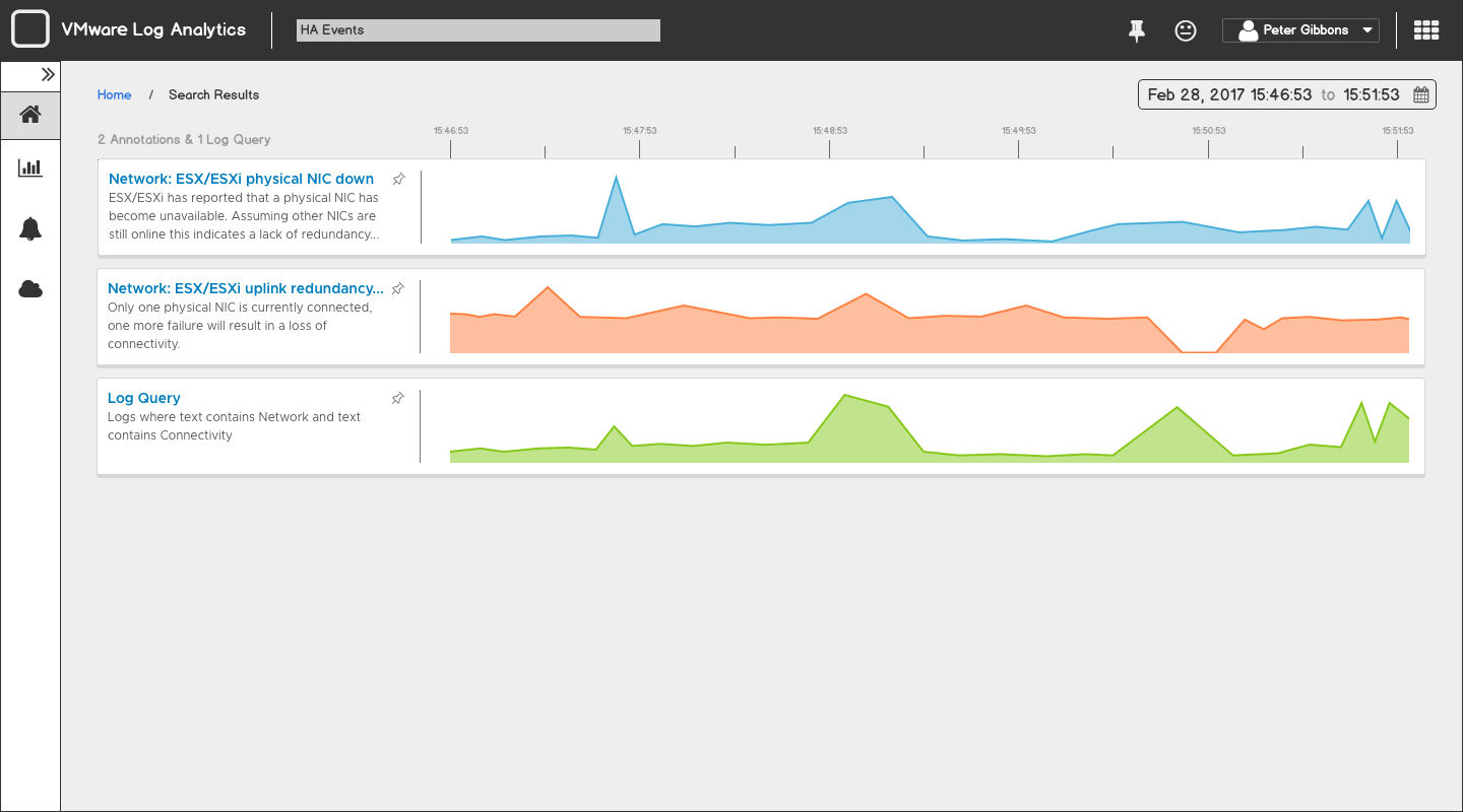
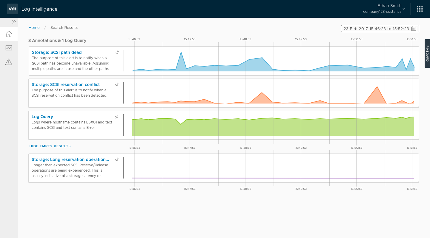
One other benefit that arose from this system was around charting. Balsamiq is great for a lot of wireframing needs, but if the user’s workflow requires changes in the chart data, Balsamiq quickly breaks down. Sketch on the other hand can show high fidelity chart representations. Because Sketch was already part of the publishing process, it was easy to layer hi-fi charts over the top of the lo-fi screens.
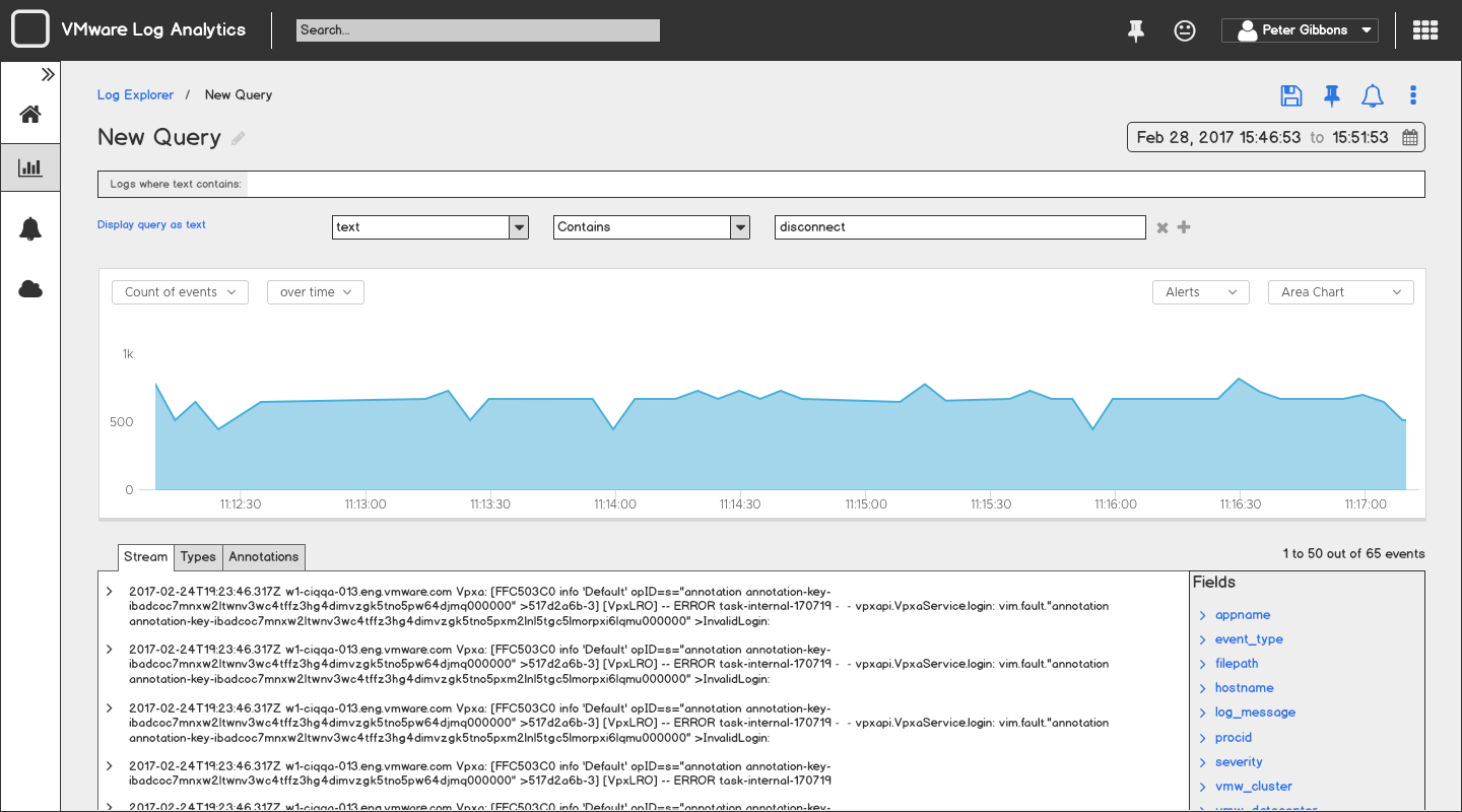
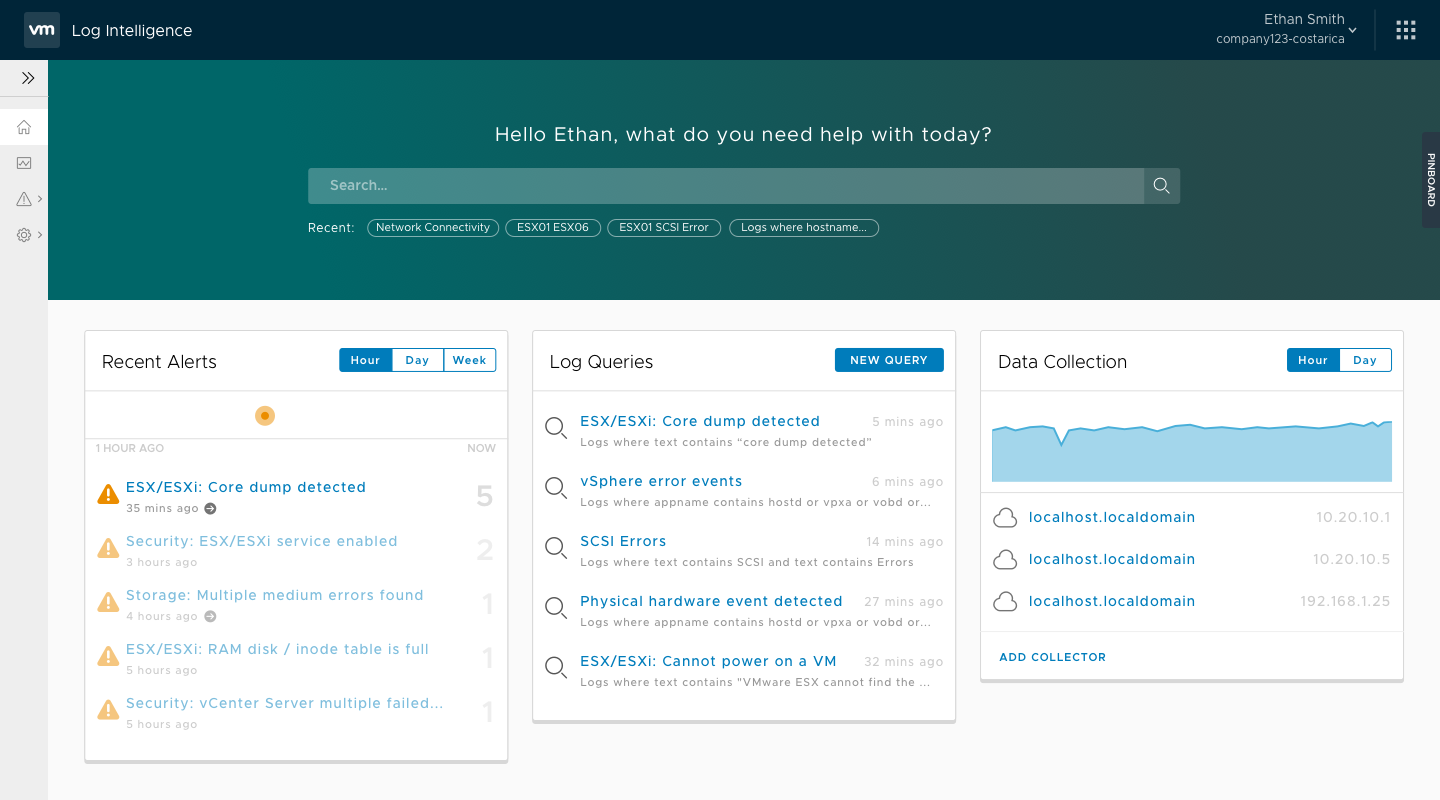
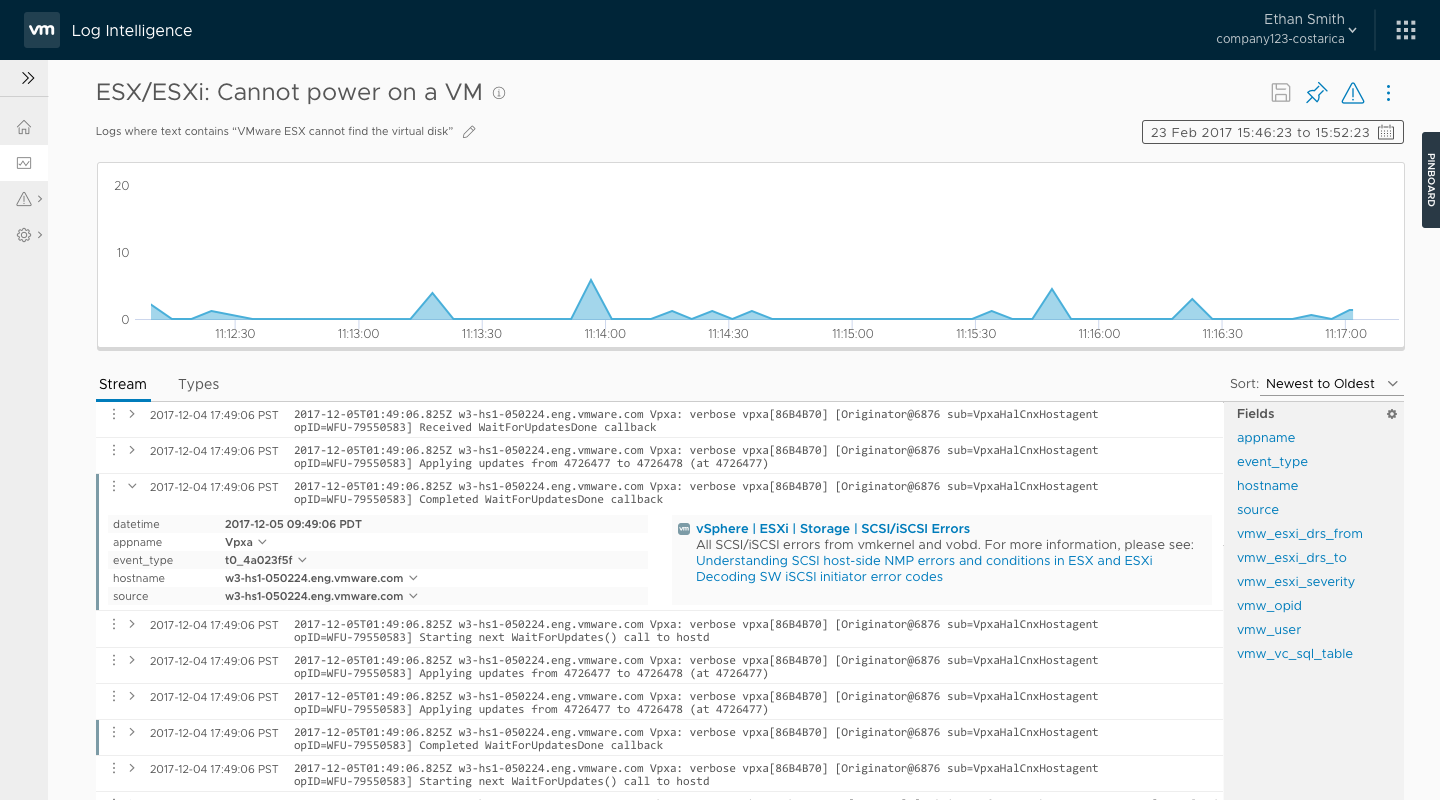
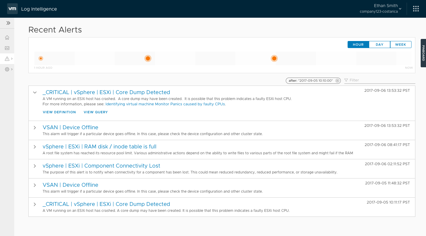
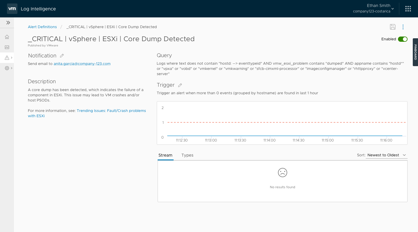
This was the stage where the differences between our two personas became the most visible. Most analytics tools have a screen that's dedicated to complex queries and results, which is tailored to our log expert persona, Anthony. But to satisfy our Anita persona, we needed an alternative method for her to extract value.
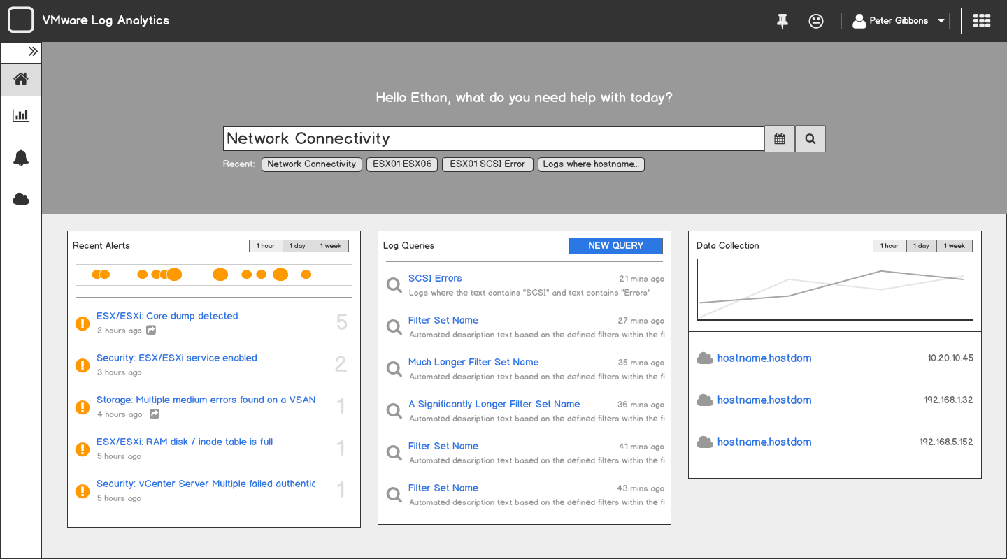
After a few brainstorming sessions, we concluded that a search-based interface tied to a marketplace of pre-built queries would be the most accessible interaction. This would allow Anita to search for known terms that are associated with an issue without knowing the specific log syntax associated with the issue.
VMware is relatively unique in the world of enterprise software, as it has its own design system which has been open-sourced to the community. The Clarity design system dictates many of the Angular components we’d be using in Log Insight Cloud, so I made sure to realize some of the screens in high fidelity early in the process so the design direction would be clear.
In July of 2017, we passed a major milestone and moved in Beta. Getting to that point hadn't been easy. Because of the tight schedule, multiple engineering teams had been running in their own parallel tracks. They had assumed all the pieces would connect smoothly, but there were some notable gaps. The ESO team (read: QA) were engaged at that point, and the picked up my 5 narrative scenarios as a basis for their end-to-end testing scripts.
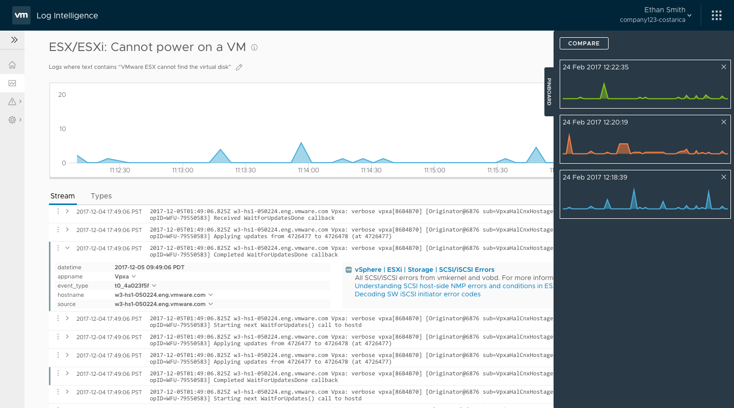
One of the features that engineering had dropped due to time was a dedicated comparison feature, as we thought there were some alternative ways a user could achieve the same functionality. As ESO began testing the end-to-end scenarios, it became clear that it wasn’t a sufficient answer.
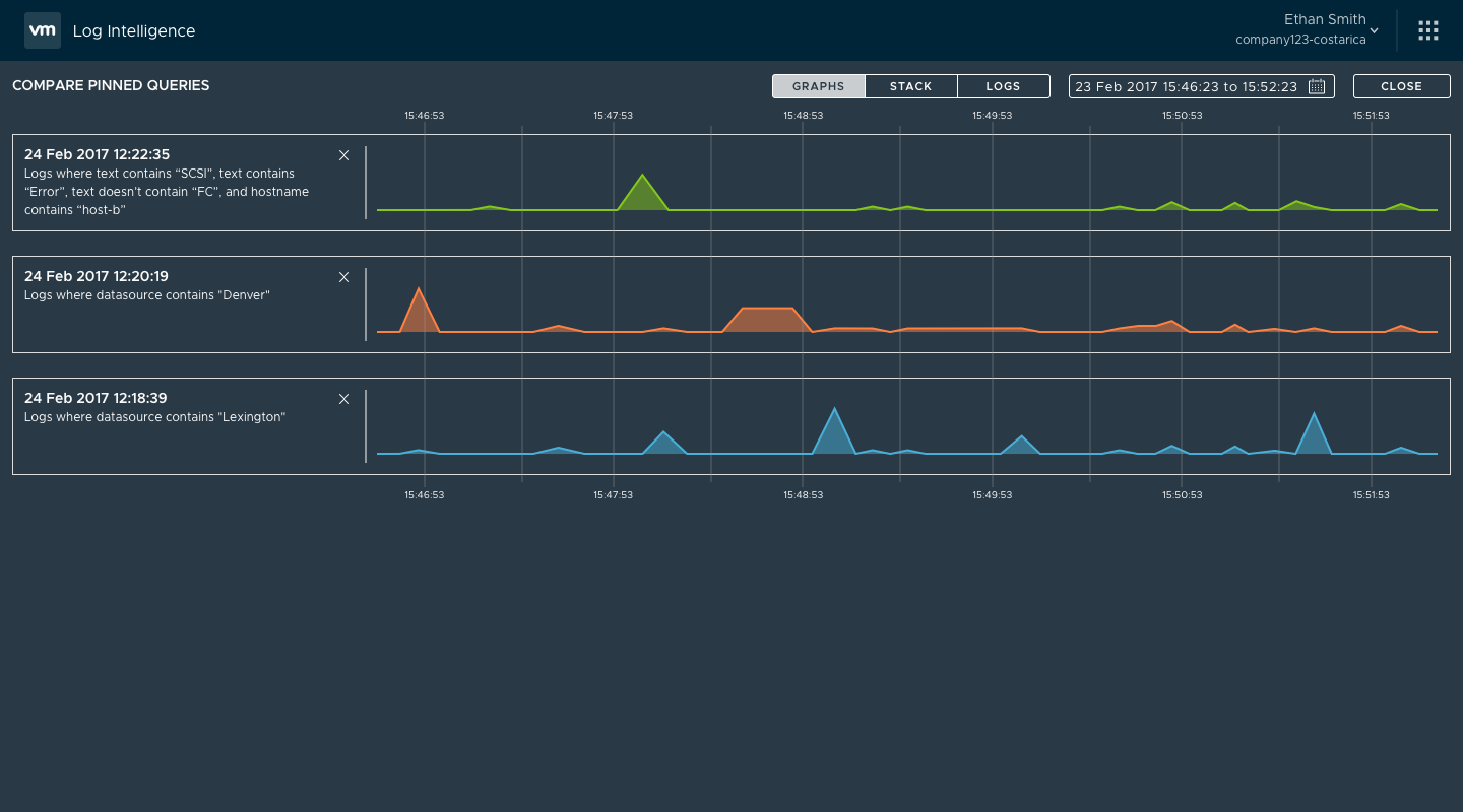
I returned to some of my earlier designs sprints and the direction that resonated best with our stakeholders was a pinning function. Users could run a query and then pin it to a pinboard. Once the pinboard contained more than one pinned query, the user could ‘compare’ the queries by showing them in a full-screen compare mode.
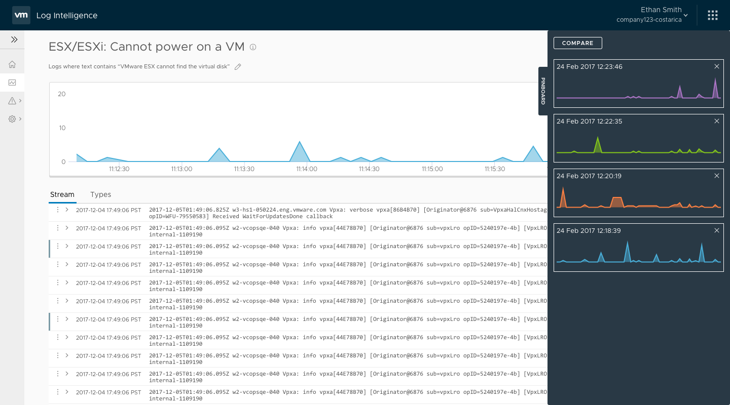
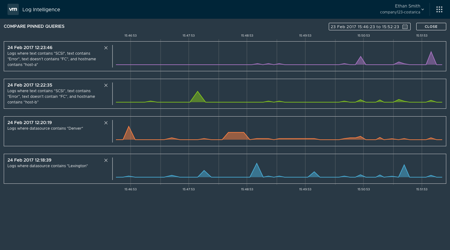
User and product management feedback showed this to be a good direction, but engineering was concerned with the amount of effort to create this full-screen compare mode. The effort involved would’ve pushed the feature out of the beta, so instead I looked for alternatives. When I had mocked the screens in Sketch, to save time I had re-used the charts from the search result screen. I decided to take that line of thinking a step further so that comparing the pinned queries would use the search results screen. While not quite as visually pleasing, it was functionally identical and something that engineering could implement quickly.
With a few final tweaks, Log Insight Cloud was meeting all the end-to-end scenarios, which made us comfortable enough to begin taking on customers. By the time VMworld 2017 came, we had one internal and one external customer, but more importantly we had 3 more customers in the pipeline. Most importantly, feedback was starting to trickle back in!
During our beta period, we regularly met with our customers to gather feedback. Early in the process, one of our customers (we can call him Brian) noted that he hadn’t convinced his users to adopt a new tool, but would continue to try. My question to him was whether or not he used the service, even though I already knew the answer was ‘no’ based on our telemetry data. Brian noted that his job was a little different, and as a result his use of a log analytics was different. What he typically did was log in 2 or 3 times a week and ran 4 to 6 saved queries. He’d then look over the results to see if there were any strange outliers, in the event that their alerts had missed something. If he found something, he’d handoff that knowledge to someone else to follow up.
This wasn’t a case we’d run into during our initial research, but Brian didn’t really match our personas either. He was more of a secondary persona of a manager, who used the tool when he had the opportunity. Because we wanted all our initial customers to feel successful, our product manager agreed that we should expand our scope to cover this case.
The initial (and somewhat easy) answer for how to address this was to just to replicate the dashboard systems Brian used in his other log analytics tool. I felt strongly that we shouldn’t do this, because from experience I know that building a dashboard system is a slippery slope of a feature, which I didn’t think we could do justice to in the time we had before our slated initial release.
Instead, the lead UI engineer and I had a brainstorming session and concluded that we could improve upon our user’s workflow by building a simple anomaly detection system. Rather than running queries and having a human looked for abnormalities, we could codify outlier detection on those same queries and surface them only when they occur, much the same way we highlighted alerts when they triggered.

Once we had a proof-of-concept, we took the design back to Brian who not only validated the concept but noted it was far better than anything he had imagined. His biggest ask was, “How soon can I have it?” As it turned out that was a bigger ask than we’d initially thought, as there weren’t resources on the backend to support the feature. Thankfully, the engineering UI lead felt as strongly about it as I did, so we found a way to push the feature into production using only the existing backend API.

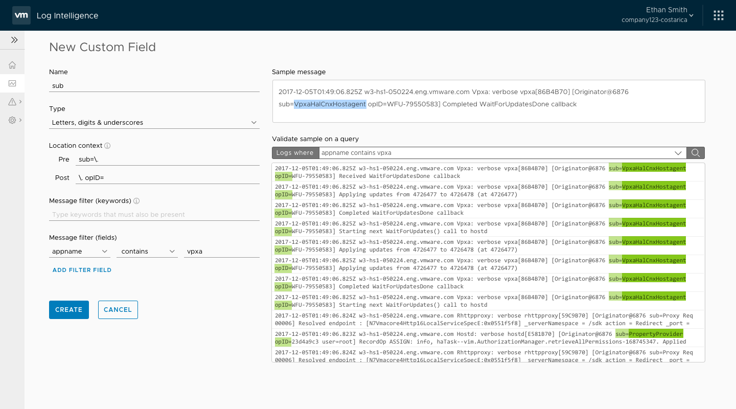
The beta period saw many improvements to the software based on customer feedback and our own internal usage. We pushed up some of our backlog features, including custom field creation and ability to view a given log entry in context. Once those new features were complete, we worked to make sure the UI was solid. At this point, I started transitioning off of the Log Insight Cloud product onto Wavefront by VMware, but I stayed in close contact with the team to answer any UX suggestions, and give feedback where possible prior to initial public availability of the service.
Public announcement of the Log Insight Cloud service was made on 5 March 2018, though initially it was called Log Intelligence. Public availability followed weeks later, but by that point I had been reassigned to a new product.
In late 2019, the service was renamed to vRealize Log Insight Cloud, and is still in active service at the time of the case study.